Most apps fail in the planning phase not the build phase. Here's how to make sure yours doesn't.
Why Planning Is the Most Underrated Part of App Development
Here's a scenario that plays out more often than anyone in tech likes to admit. A founder has a great idea. They hire developers, everyone gets excited, the build begins and six months later, they have an app that does everything except solve the original problem. Features nobody asked for, a scope that doubled, a budget that tripled, and a launch date that's a moving target.
Sound familiar? It should. This is scope creep in its natural habitat, and it's the single most common cause of Flutter project failure. Not bad code. Not wrong technology. Bad planning.
The good news is that structured project planning is a learnable discipline and Flutter projects, because of the framework's cross-platform nature and rapid iteration capabilities, actually reward good planning more than most. As notes, teams that invest in thorough upfront planning consistently ship and stay significantly closer to their original budget.
This guide walks you through a proven, step-by-step flutter project roadmap from that initial idea all the way to App Store launch. We're covering MVP scope, architecture, user journeys, wireframing, tech stack selection, agile sprints, team structure, risk mitigation, testing strategy, and launch prep. In the right order. With real tools and real decisions at every stage.
Let's build the right thing, the right way.
Your Flutter Project Roadmap at a Glance
Before diving deep into each phase, here's the complete flutter project roadmap. This is your North Star the sequence of decisions that separates a successful launch from an expensive lesson.
| # | Phase | Key Deliverable | Primary Tools | Timeline |
|---|---|---|---|---|
| 1 | Problem & Goal Definition | Problem statement, success metrics | Notion, Miro | Week 1 |
| 2 | MVP Scope (MoSCoW) | Prioritized feature list | Notion, FigJam | Week 1–2 |
| 3 | User Journey Mapping | User flows & personas | Miro, FigJam | Week 2 |
| 4 | Wireframing & Figma Design | Lo-fi → Hi-fi screens | Figma | Week 2–4 |
| 5 | Architecture & Tech Stack | MVVM blueprint, stack decisions | Docs, Notion | Week 3–4 |
| 6 | Project Structure & Riverpod | Folder structure, state plan | VS Code | Week 4 |
| 7 | Sprint Planning & Agile Setup | Sprint backlog, velocity baseline | Jira / Linear | Week 4–5 |
| 8 | Risk Register & Budget | Risk mitigation plan, cost estimate | Notion, Sheets | Week 5 |
| 9 | Testing Strategy | Test plan (unit to E2E) | Flutter test, Patrol | Ongoing |
| 10 | Launch Prep (ASO + Beta) | Store listings, beta group | App Store Connect | Week 10–12 |
01 Problem & Goal Definition
The foundation everything else is built on get this wrong and nothing else matters
The most dangerous words in app development are 'let's just start building.' Before a single line of Flutter code is written, before Figma is opened, before anyone argues about state management you need to answer three questions with brutal clarity.
-What problem does this solve? Not 'what does this app do' what specific, painful, real problem does it eliminate for a specific person?
-Who exactly is the user? Not 'everyone' give them a name, a job, a location, a frustration. The more specific, the better the product.
-How will you measure success? Downloads? Daily active users? Revenue? Retention rate? Conversion? Pick your 2–3 north star metrics before you build.
This sounds obvious. It rarely gets done. The teams that answer these questions in writing, on a shared document that everyone references throughout the project, build dramatically better products than the ones that keep the answers in one person's head.
Deliverable: A one-page product brief problem statement, target user persona, success metrics, and a single sentence describing the core value proposition.
Reality check: If you can't explain your app's core value in one sentence that a stranger immediately understands, your planning isn't done. Keep refining until you can.
02 MVP Scope Using MoSCoW
The art of deciding what NOT to build your most important skill as a product planner
Every great product founder has learned this lesson, usually the expensive way: your first version should do one thing extraordinarily well, not ten things adequately. The MVP (Minimum Viable Product) isn't a stripped-down version of your vision it's a focused test of your riskiest assumption.
Feature priority is where the earns its place in every serious planning process. It's a simple framework that forces brutal prioritization before scope creep has a chance to take root.
| Priority | Definition | Rule of Thumb | Example Feature |
|---|---|---|---|
| Must Have | Core functionality. App fails without it. | Max 40% of features | User authentication |
| Should Have | Important, but launchable without. | ~30% of features | Push notifications |
| Could Have | Nice additions if time/budget allows. | ~20% of features | Dark mode |
| Won't Have | Out of scope for this release. | ~10% of features | AR product viewer |
Scope creep the gradual, insidious expansion of 'Must Have' to include everything on the whiteboard is as the single biggest risk in MVP development. The MoSCoW framework is your defense.
Deliverable: A MoSCoW-prioritized feature list in Notion or a shared spreadsheet. Every team member signs off on what's in and what's out for v1.
Insert image: MoSCoW priority matrix template in Notion showing Must/Should/Could/Won't columns with example features populated for a fintech Flutter app
03 User Journey Mapping
Walk in your user's shoes before you build their path
You have your feature list. Now you need to understand exactly how a real user moves through your app from the moment they first open it to the moment they complete the core action you designed for. This is user journey mapping, and it's the bridge between 'features' and 'product.'
A user journey map documents every touchpoint, emotion, decision point, and potential frustration a user encounters. For a Flutter app, this translates directly into screens, navigation flows, state changes, and edge cases.
Creating Your User Personas
Define 2–3 primary user personas. Each gets a name, demographic, device preference (iOS or Android this matters for Flutter's Cupertino vs Material design decisions), technical comfort level, primary goal, and biggest frustration. For international products targeting MENA or Asia, localization requirements often surface at this stage better now than after you've hard-coded English strings everywhere.
Mapping the Core Flows
For each persona, map the critical flow: onboarding → core action → retention loop. Use Miro or FigJam for visual flow mapping. At this stage, you're working with boxes and arrows, not designed screens. Speed matters; beauty does not.
-Onboarding flow: First open → sign up/log in → first value moment (the 'aha' moment your retention depends on)
-Core action flow: How does a user accomplish the primary task the app was built for?
-Error states: What happens when something goes wrong? Empty states, network errors, validation failures
-Return journey: Why does the user come back tomorrow? What's the hook?
Deliverable: A complete user flow diagram for each persona's primary journey, exported as a shared reference document.
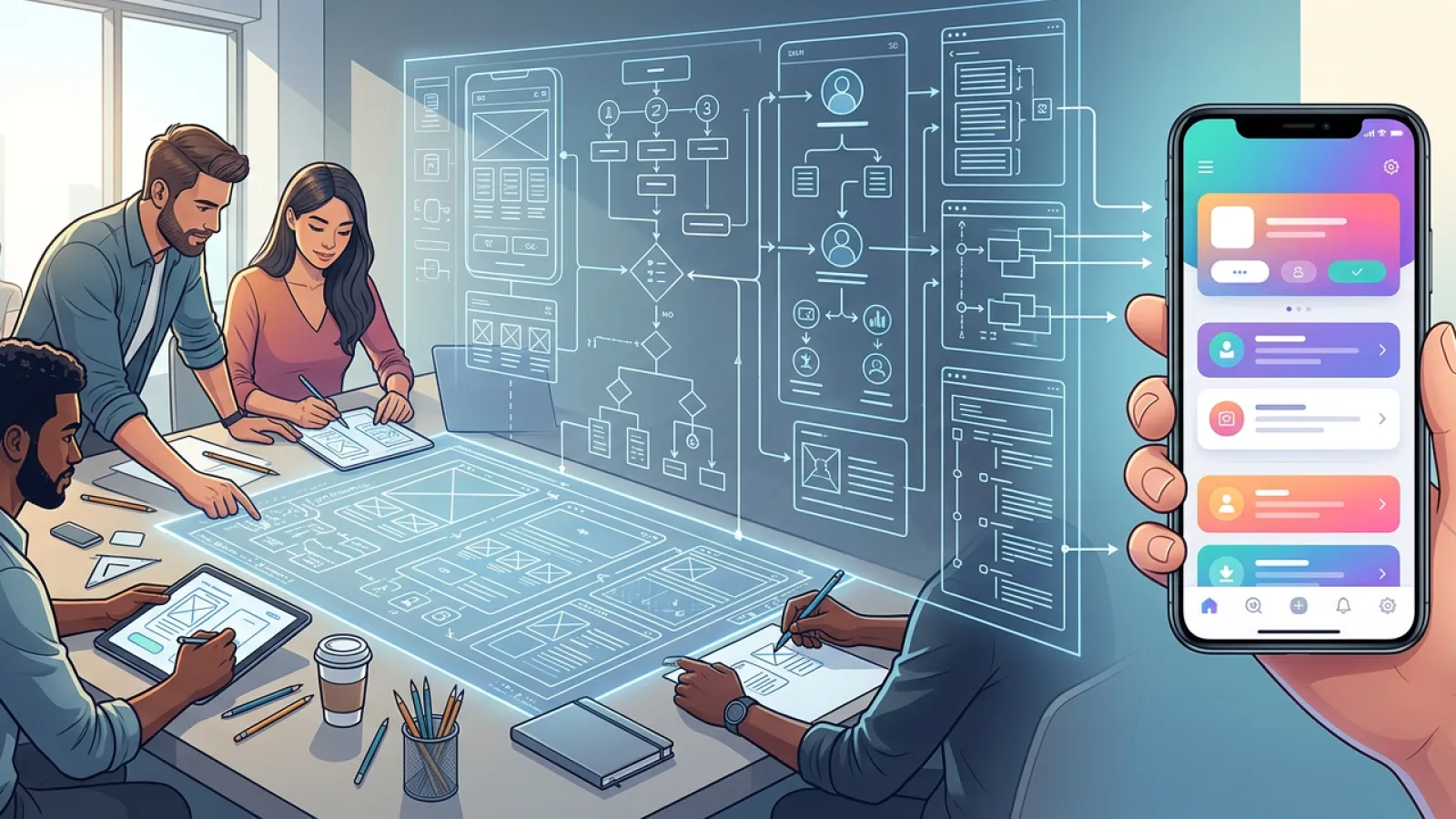
04 Wireframing & Figma Design
From flow to form translating user journeys into real screens
Wireframing is where abstract planning becomes concrete product. And in 2026, Figma is the non-negotiable standard for Flutter UI design not because other tools don't exist, but because Figma's component system, auto-layout capabilities, and developer handoff features align perfectly with Flutter's widget-based architecture.
Flutter's Material Design 3 widget library maps remarkably well to Figma's Material 3 design kit, available free from Google. This alignment means what your designer builds in Figma closely resembles what your developers implement in Flutter that plagues projects using mismatched design tools.
Phase 1: Lo-Fi Wireframes (Week 2–3)
Start with low-fidelity wireframes grayscale boxes and placeholder text that define layout, hierarchy, and navigation structure without distracting anyone with colors or fonts. The goal is speed and iteration, not polish. Run these past stakeholders early; changing a box in Figma takes five seconds. Changing built Flutter screens takes five hours.
Phase 2: Hi-Fi Mockups (Week 3–4)
Add color, typography, real content, and your brand identity. Apply Material Design 3 components from the Flutter design system you'll see immediately which of your conceptual layouts actually work at the component level and which need rethinking. Export with proper naming conventions that mirror your Flutter widget structure.
Insert image: Figma workspace showing lo-fi wireframes on the left evolving into hi-fi Material Design 3 mockups on the right, with Flutter component annotations
Design-to-code tip: Name your Figma frames and components to match your Flutter widget names (e.g., 'HomeScreen', 'ProductCard', 'AuthButton'). Your developers will thank you and the handoff process becomes dramatically smoother.
